Proof of Concept and Development


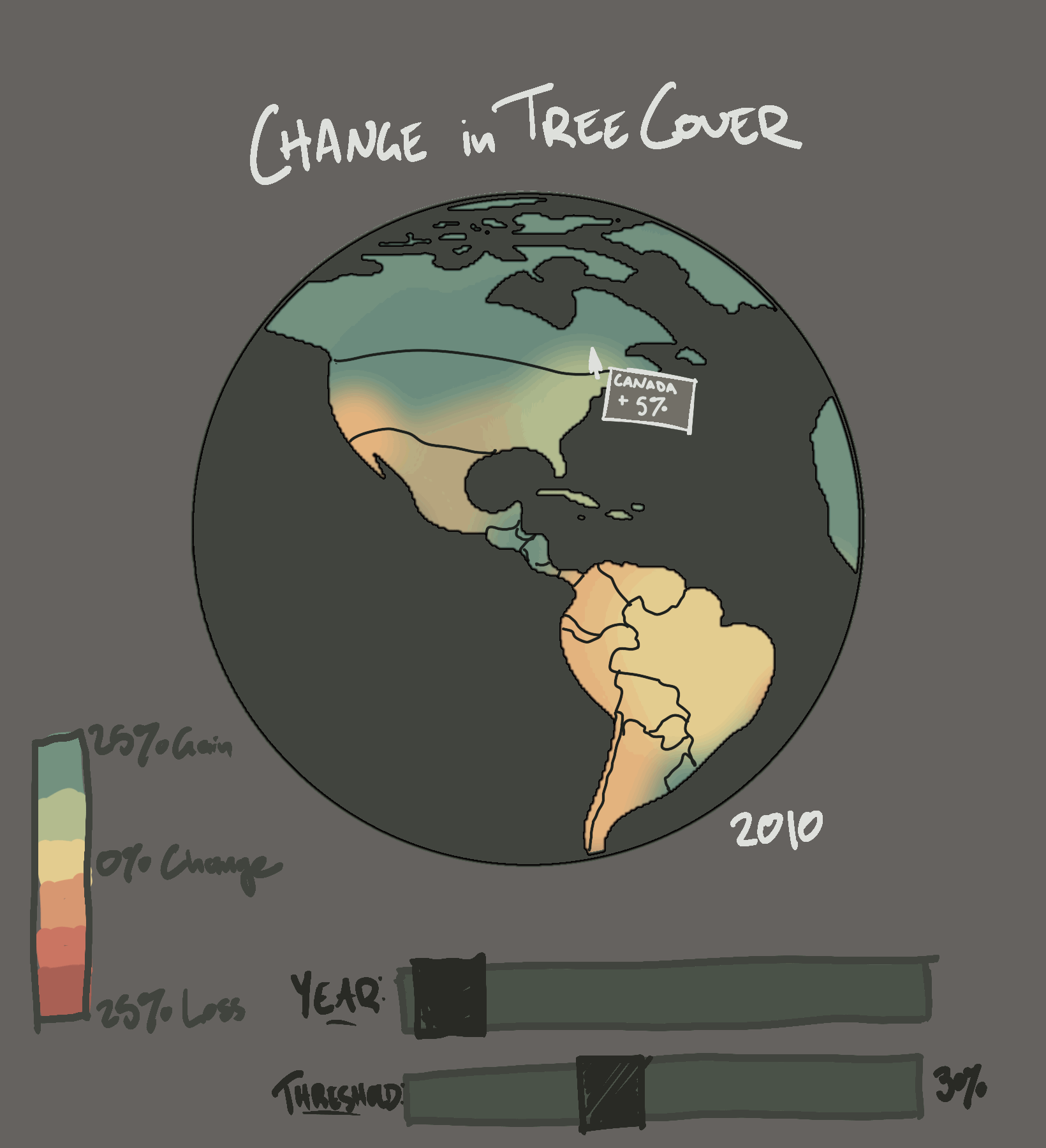
Concept sketches, showing the idea for various amounts of tree coverage, highlighted country data, and the idea of sliders to highlight different aspects of the data set.
Exploration of suitable color schemes, and mapping color values to the data.

Data Visualization
For this project, I created an embedded data visualization of annual tree coverage loss using javascript and html.
The data visualized for my project is the global tree coverage data from the Global Forest Service. This dataset details the change in tree cover across the globe between 2000 and 2021 for different countries. It was taken from satellite data by Hansen et. al (2013) with changing data collection methodology after this year. For this dataset, questions I was be interested in investigating included: are there differences in deforestation in different areas of the globe? Can these differences be related to economic status? Can they be related to starting forest density? What areas show reforestation?
Sources: https://www.globalforestwatch.org/dashboards/global/?category=forest-change
https://www.science.org/doi/10.1126/science.1244693
The Github for this project can be found here.